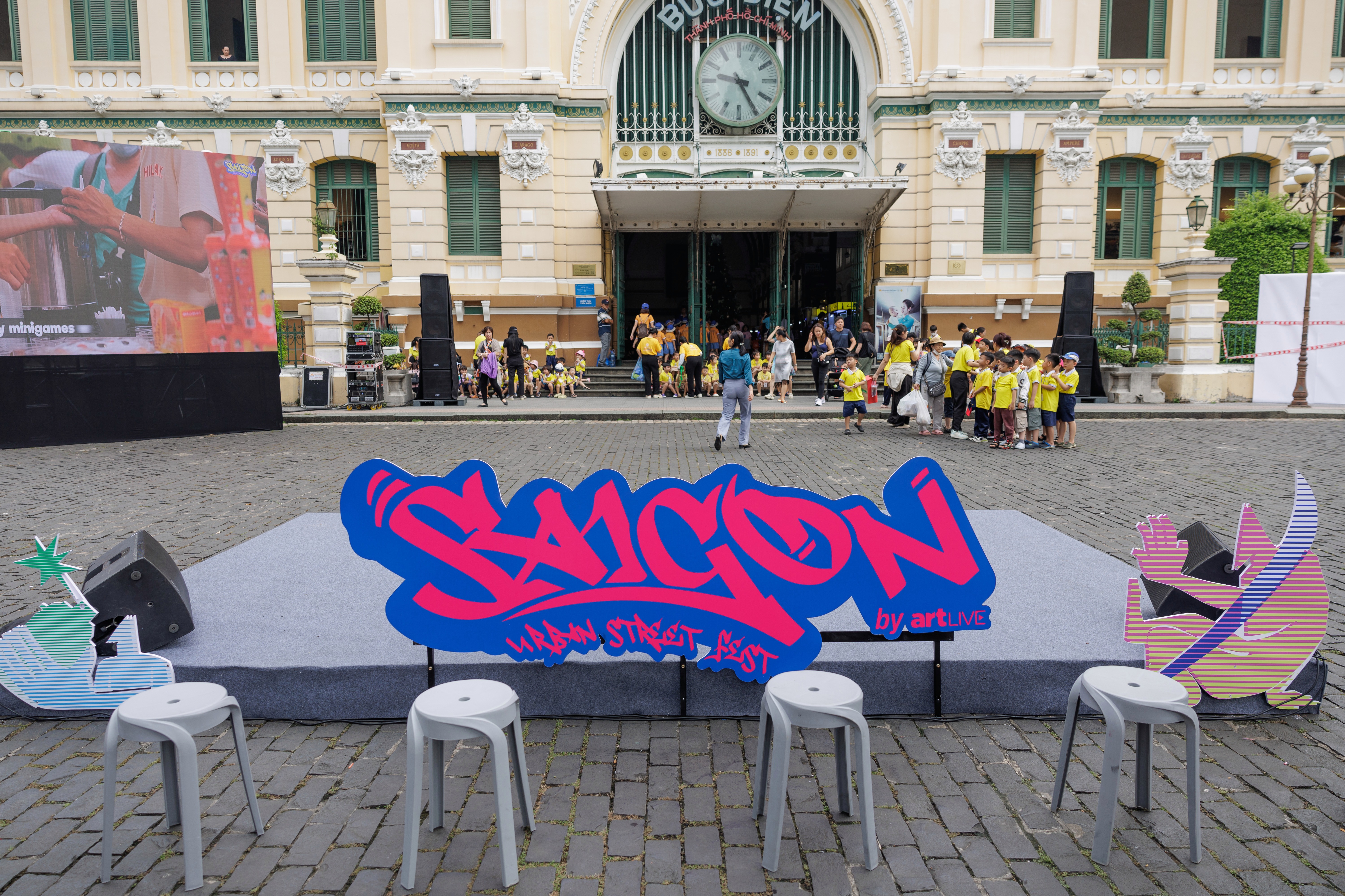
artLIVE – Saigon Urban Street Fest by artLIVE is an event that brings the spirit of street culture to the public through vibrant art and music performances. The event’s fresh visual identity draws inspiration from the bold, spontaneous lines of youthful and dynamic street art.
Saigon Urban Street Fest by artLIVE is a street art, music, and performance event created for both local and international audiences – especially young people living in Ho Chi Minh City. In its first year, the festival carries the theme “Head Out Of The Original”, encouraging the idea that art can go beyond its original form and reach new, broader dimensions.
Reflecting this spirit, the festival’s visual identity combines bold colors with elements of both classic and contemporary street art, capturing the dynamic and youthful energy of the event.
The vibrant colors of youthful energy
The three representative colors of Saigon Urban Street Fest by artLIVE – yellow, blue, and pink – are bold and high in contrast, symbolizing the energy and boundary-breaking spirit of today’s youth.
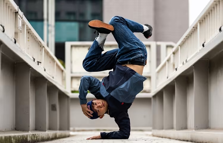
The festival draws inspiration from the foundational and classic elements of street art, such as Hip-Hop, Graffiti, and Rap, setting the stage for fresh, modern, and creative expressions to emerge.

Yellow represents youthful energy, creativity, and optimism. It brings a vibrant highlight to street art and serves as a constant source of inspiration. This color was chosen to emphasize the word “Saigon” – not only to convey dynamism but also to create a striking visual focal point within the street art space.
In contrast, blue is used to add depth and shadow to each letterform. It symbolizes freedom – the ability to move beyond fixed boundaries – and highlights the value of individual expression.
For Saigon Urban Street Fest, blue also reflects the blend of classic and contemporary, continuously opening new artistic dimensions.
It is in these spaces where creative lines and blue tones become icons of visual art – bridging past and future, tradition and innovation. Blue becomes a visual language of contemporary street art, representing renewal and unrestricted creativity.

Above all, pink symbolizes innovation and breakthrough, representing the diversity within street art, a space without limits in terms of age, gender, or nationality. Pink also creates a strong visual contrast when paired with blue and yellow in the visual identity of Saigon Urban Street Fest. This striking combination highlights the vibrancy and variety of street culture, radiating youthful energy and liveliness.
The thoughtful blend of yellow, pink, and blue forms a unique visual harmony that brings a bold and youthful spirit to the festival’s identity. While yellow stands for dynamism and creativity, pink represents renewal and diversity, and blue reflects freedom and openness.
Each color plays a vital role in shaping the energetic atmosphere of the event, enhancing the individuality and vitality of Saigon Urban Street Fest, and delivering a distinctive artistic experience to every participant.
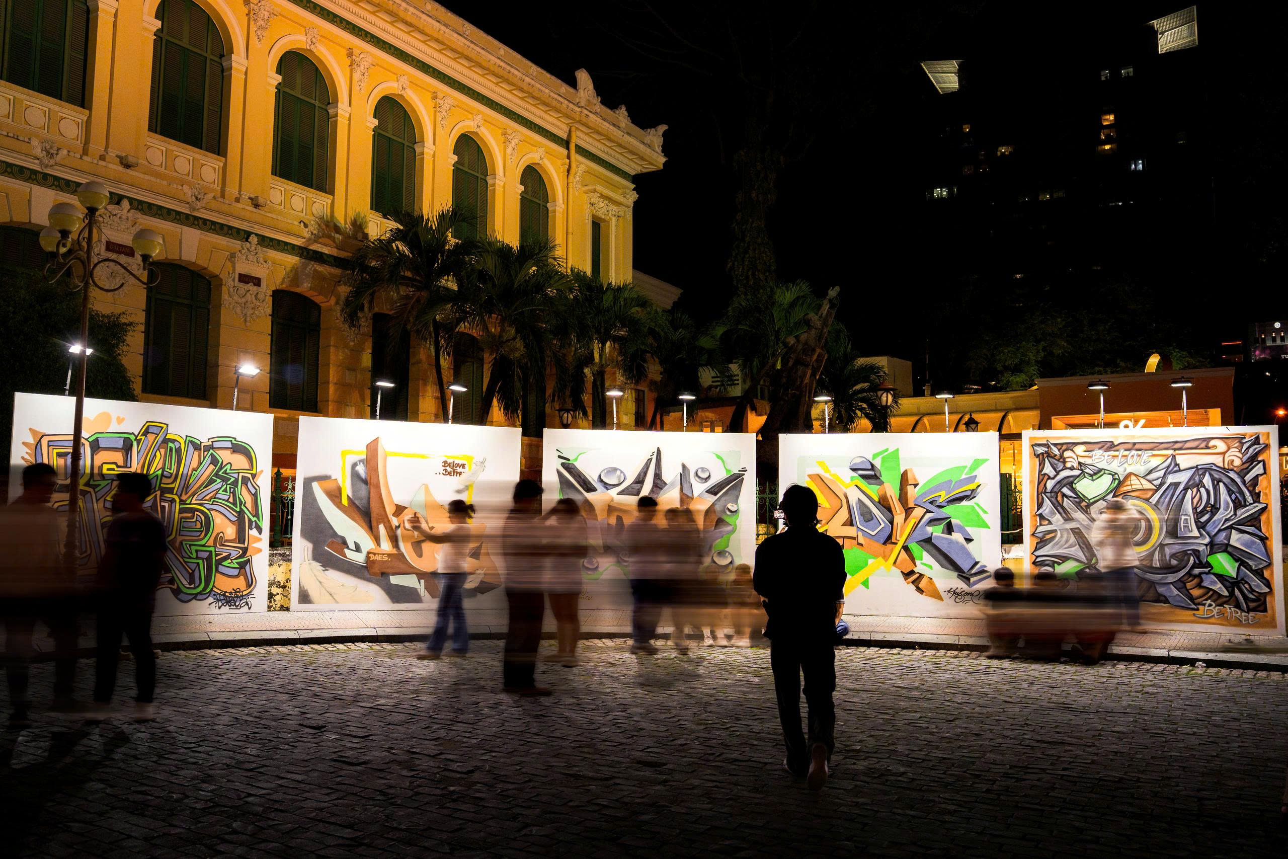
Graffiti as a defining element
The visual identity of Saigon Urban Street Fest incorporates distinctive Graffiti-inspired elements through the use of the Another Tag typeface, a font with a bold urban aesthetic created by a designer specializing in Graffiti and street art.
This choice captures the true essence of street culture and reflects the festival’s deep passion for contemporary art.

The letterforms of the Another Tag font are not only distinctive but also highlight the modern, urban edge that defines street art. This design choice reflects the dynamic visual spirit of youth while also serving as a shared voice for creativity and a cross-generational perspective.
Through this approach, Saigon Urban Street Fest presents itself as more than just a street art festival. It becomes a source of inspiration for those who share a passion for creative expression.

To convey its key messages, Saigon Urban Street Fest also uses IBM Plex Sans Condensed in both regular and italic styles. This Grotesque-style font is visually clean and reader-friendly, creating a smooth, harmonious visual experience. It brings a sense of modernity and professionalism while ensuring that written content remains accessible and easy to read.
Moreover, the thoughtful pairing of Another Tag with IBM Plex Sans Condensed allows the festival’s messaging to be both clear and expressive, offering a flexible and approachable connection with the audience.
Illustrated strokes with a street art spirit
To embody the theme “Head Out Of The Original”, Saigon Urban Street Fest incorporates bold, angular strokes that symbolize the free-flowing rhythm found in street art activities.
These stylized lines also represent the energy and explosive creativity that the festival aims to share with the public—a reflection of the dynamic and positive spirit that defines urban art.

In addition, the illustration style of Saigon Urban Street Fest is defined by the aesthetics of Graffiti art – a form that inherently represents street culture and echoes the festival’s theme of breaking boundaries.
Creative linework combined with symbolic colors offers a well-rounded, visually engaging identity. This thoughtful fusion highlights the depth of street art while showcasing the distinctive personality of Saigon Urban Street Fest.

The visual identity of Saigon Urban Street Fest captures the spirit of youthful energy, boldness, and the drive to break boundaries. At the same time, it reflects a balanced blend of classic and contemporary influences.
With this foundation, the first-ever Saigon Urban Street Fest promises to be a playful, open space for street culture — where every element, though full of edge and creativity, is presented through a lens of beauty and artistic purity.