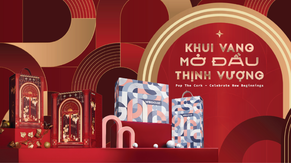
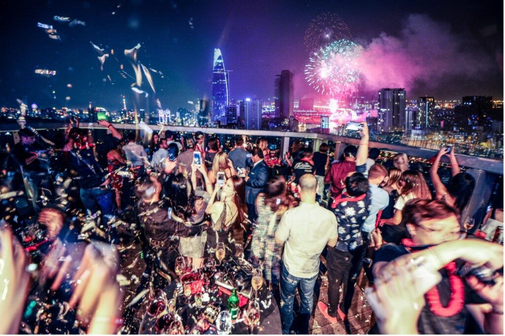
artLIVE – Taste of Saigon is an annual festival celebrating the art of flavor, created for the public who share a passion for food, music, and culture. The event’s distinctive visual identity embodies a vibrant, youthful spirit, capturing the attention and imagination of the community, especially the younger generation.
Taste of Saigon is a vibrant annual festival celebrating the art of flavor, open to the public. In its inaugural year, themed “Set the Vibes”, the festival aims to spark creativity and openness, reflecting the spirit of a colorful, free-spirited young generation.
Its visual identity is a harmonious fusion of bold colors and fluid lines, brought to life through a modern, liberating design language that captures the essence of the event.
From flavors to colors
The five signature colors of Taste of Saigon by artLIVE draw inspiration from the five fundamental tastes in culinary art: umami, sour, sweet, salty, and bitter.

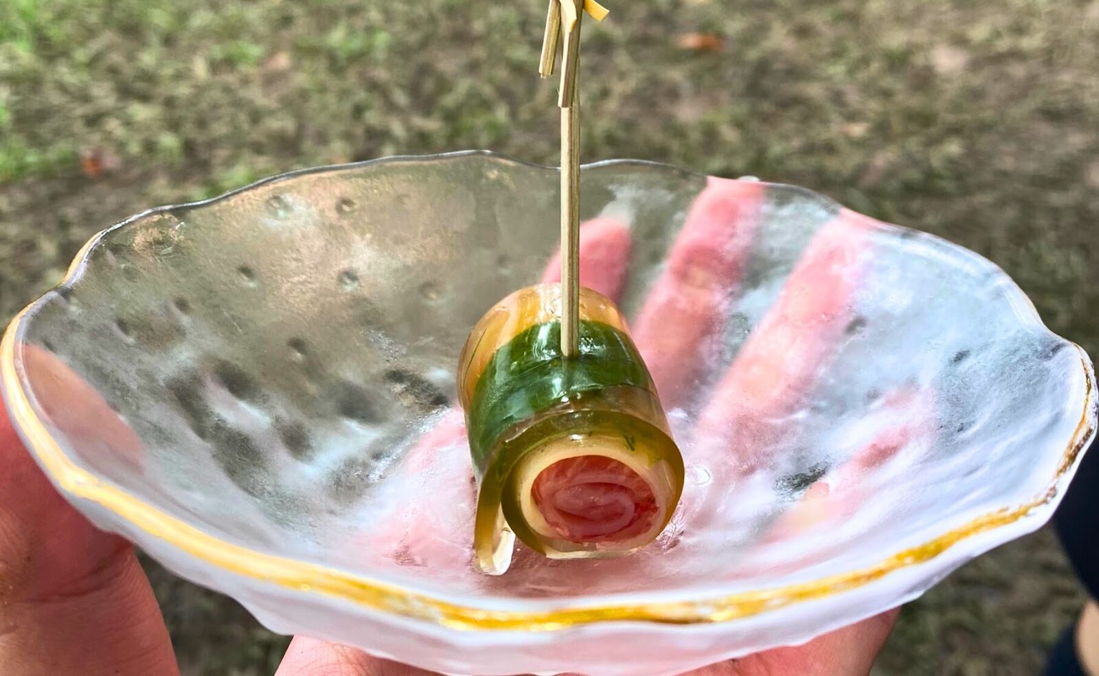
One of the event’s primary colors is orange, representing umami, often referred to as “the essence of deliciousness”. Umami originates from the taste of glutamate, an amino acid that serves as a building block of protein. Glutamate occurs naturally in the human body and many foods such as salmon, mushrooms, tomatoes, and green tea. Umami not only enriches our culinary experiences but also plays an essential role in ensuring adequate protein intake for growth and bodily maintenance.
In the event’s visual identity, the color yellow makes a particularly striking impression. Yellow symbolizes the sour taste, our body’s natural signal for the presence of acids in food. In small amounts, sourness is often pleasant, making it a useful indicator of whether food is safe or enjoyable to consume. It also helps us detect when the fruit has reached peak ripeness.

In addition, the sweet taste, one of the five fundamental flavors, inspired the use of pink in the visual palette. Sweetness provides the body with a quick source of energy. Carbohydrates, the compounds responsible for the sweet flavor, also serve as the body’s stored energy reserves. It’s no exaggeration to say that sweetness is essential to life, it helps prevent hunger, malnutrition, and the physical weakness caused by illness.
Accompanying these vibrant colors is the presence of green, symbolizing the salty taste derived from sodium, an essential element that helps regulate the body’s balance of fluids and electrolytes. In moderation, saltiness creates a pleasant sensation. However, when consumed excessively, it can become harmful, and our bodies naturally reject overly salty foods.
Finally, blue represents bitterness, a taste historically associated with potential toxins, which humans have instinctively avoided as a form of self-protection. Over time, though, bitterness has earned a place in the culinary world, with compounds like caffeine, cocoa, and tea offering complex, enjoyable flavors and proven health benefits when consumed in small amounts.

By blending the five fundamental tastes with their corresponding signature colors, Taste of Saigon seeks to convey the idea that flavor and color are deeply intertwined with everyday life. The festival aspires to deliver vibrant, multi-sensory experiences in food, music, visual arts, and more, satisfying the public’s curiosity and desire for creativity and cultural richness.
Stylized elements that breathe new life
Beyond the harmonious color palette, the visual identity of Taste of Saigon features creatively stylized graphic elements tailored to the festival’s theme. One of the event’s central inspirations, the allure of cuisine, becomes the creative spark behind the playful and engaging illustrations that define the branding.
From bottles of fine wine and refined cocktails to slices of juicy citrus, each visual detail evokes a sensory celebration of flavor that’s impossible to resist. These graphic elements are layered using transparency effects, creating a rich interplay not only of color but of taste itself. Together, they conjure the image of a vibrant feast, where every dish, carefully crafted by skilled chefs, promises to delight and surprise even the most discerning guest.

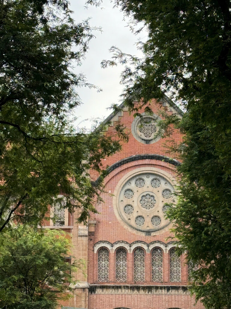
Another distinctive element of the visual identity draws inspiration from the shape of the bamboo plant, referencing the decorative louver system on the façade of the Independence Palace – a historic architectural landmark of Saigon and also the venue for the event. This idea creates a meaningful connection between the festival and the city’s cultural heritage.
As a symbol, bamboo represents a forward-looking spirit grounded in deep-rooted traditions. Through this imagery, Taste of Saigon aspires to offer fresh experiences that shape a modern, sustainable lifestyle for Vietnam’s younger generation.

For its debut edition, Taste of Saigon introduced a bold, angular typeface that perfectly embodies the spirit of its theme – “Set the Vibes” – both within the visual identity and throughout the festival itself. The meticulous yet imaginative design work by the young creative team sparked excitement and curiosity among attendees, making the experience all the more engaging.

The visual identity of the Taste of Saigon – flavor arts festival successfully captures a spirit of creativity, striking a thoughtful balance between tradition and innovation. It embodies the festival’s core concept: creative, open-minded, and forward-looking, representing a new generation of conscious consumers.
As its inaugural edition, Taste of Saigon by artLIVE promises to cultivate a vibrant “ecosystem” for young people, one that embraces a lifestyle of youthfulness, sophistication, and depth.
Photos: artLIVE